Brightpoint Activewear
Brightpoint is a women's activewear brand that prides itself on its eco-friendly and sustainable production methods. Their identity highlights a functional, clean, and open aesthetic, and these values are represented throughout the branding.
Branding

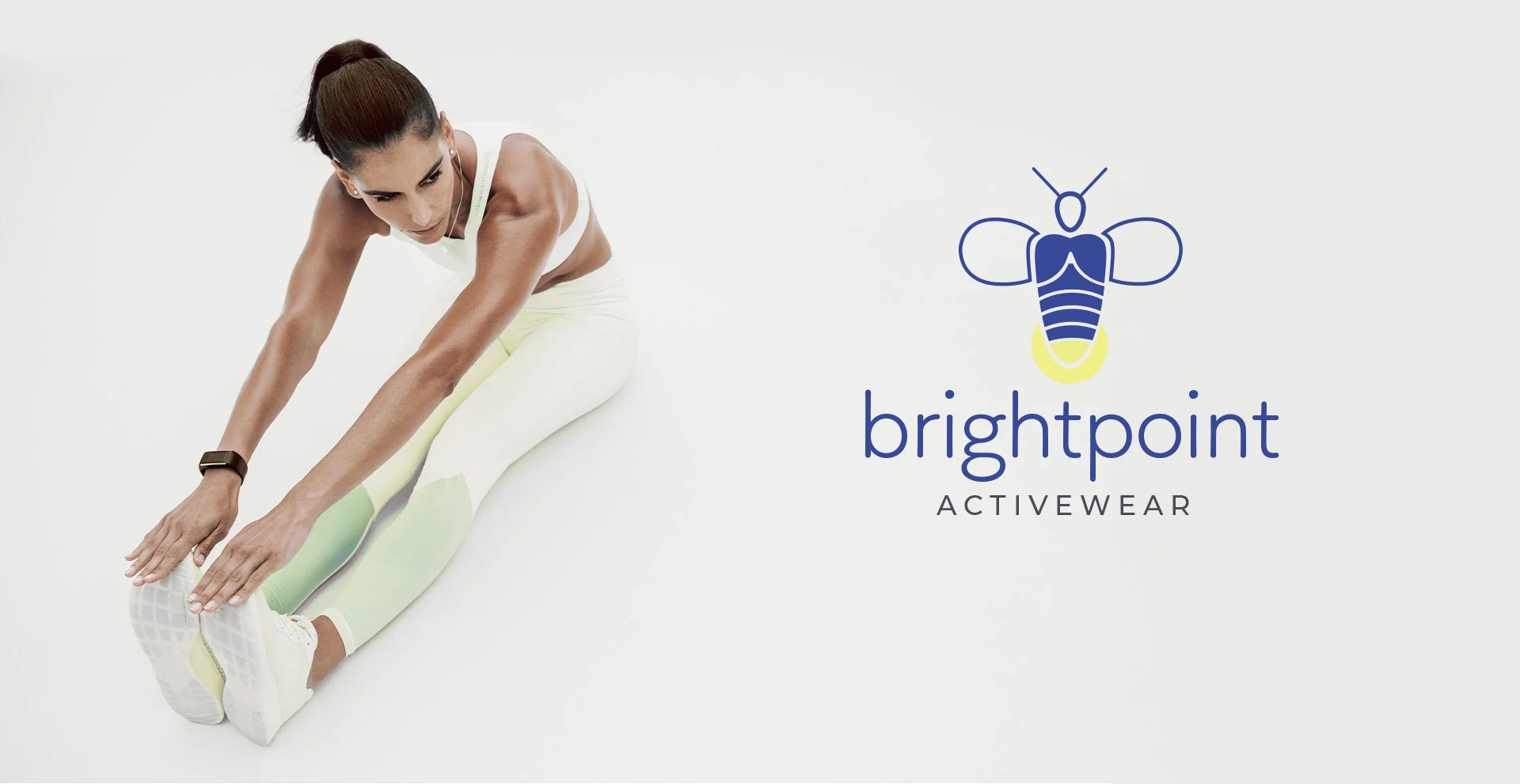

Logo Design
The logo features a pictograph of a simplified firefly with a shining light, to signify the “bright point" into the future of sustainability. The typefaces add a component of sleekness to the brand. Together, it portrays an innovative, functional, and comfortable look, which are all important aspects of the brand identity.


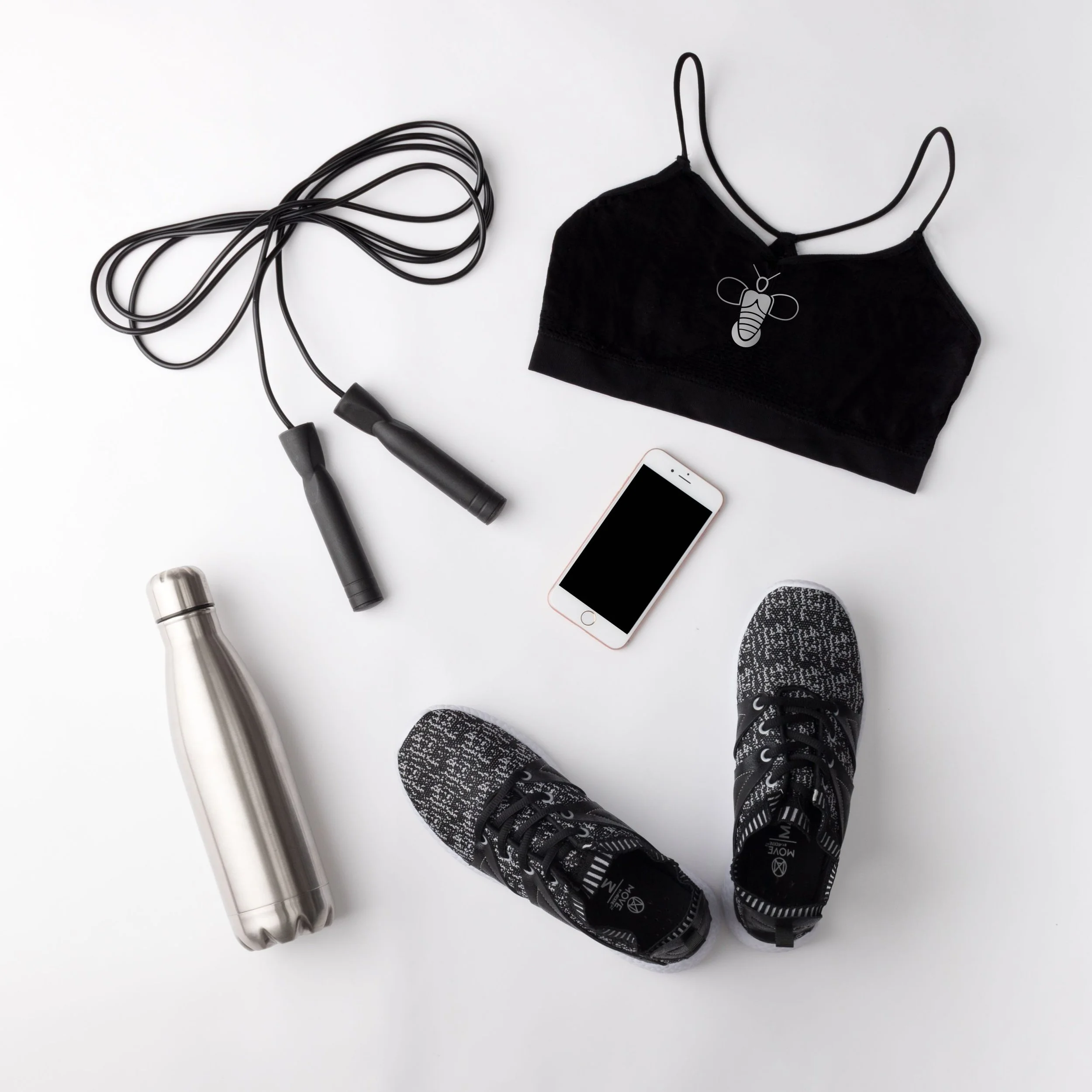
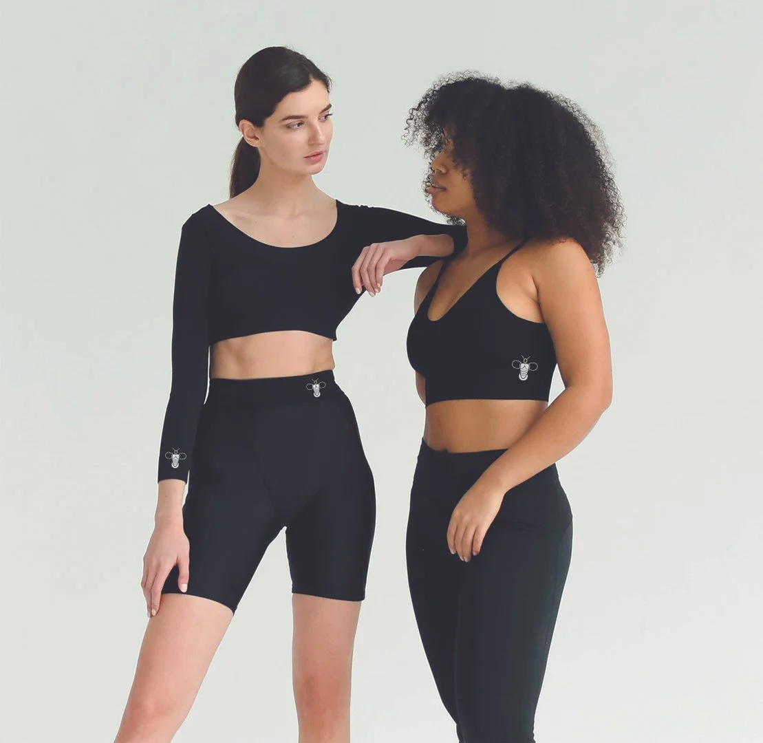
Touchpoints

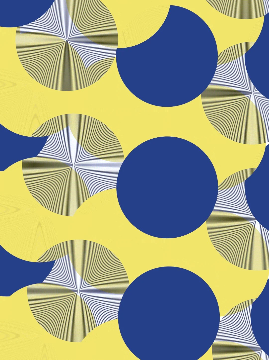
Color, Pattern & Type
The color palette of the brand is energetic, sophisticated, and serene.
The patterns is designed to convey a sense of energy, empowerment, and the harmonious fusion of style and functionality. It features a collection of interconnected circular elements, symbolizing unity, inclusivity, and the interconnectedness of women in their pursuit of an active lifestyle.
This style of type was chosen because of the rounded features. The rounded forms of the typeface convey a sense of warmth, approachability, and friendliness. It creates a welcoming and inviting feel, helping to establish a connection with the audience.