Espaço Z
During my study abroad experience in Brazil in June 2022, I was the group leader responsible for developing a brand identity for a subdivision of a non-profit organization dedicated to empowering Brazilian children and safeguarding them from the perils of street life. This organization goes above and beyond by guiding young individuals towards discovering their true passions while simultaneously shielding them from harmful environments. At the forefront of their efforts, Espaço Z provides a nurturing haven where teenagers can explore and nurture their creative potential, be it through music, dance, or art.
Branding | Web
Logo Design
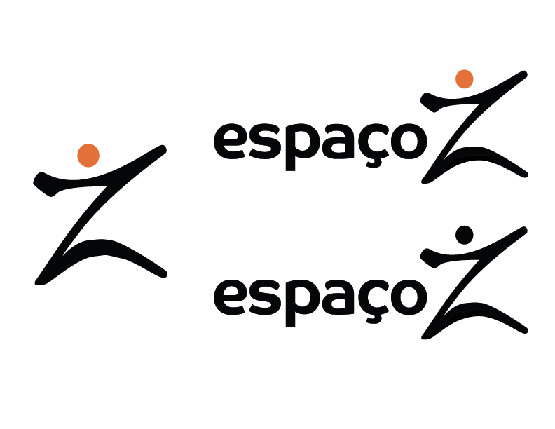
Espaço Z specializes in music, dance, and art, which I portrayed through the movement in the logo.
The color palette of this brand is warm and inviting. The orange and yellow hues represent youth and creativity.
The patterns are abstract takes on Brazilian favelas and the logo.
This style of type was chosen because of its welcoming, youthful aesthetic, and its readability. It also is unified with the design of the “Z.”


